Blog #2
Blog #2
08/17/2026
08/17/2026
|
6 min read
6 min read
|
UX Design
UX Design
Why Empty States Matter More Than Polished Dashboards
Why Empty States Matter More Than Polished Dashboards

TL;DR
TL;DR
A polished dashboard only shows what a product looks like when everything is working. Empty states shape the user’s first real experience with it.
They should explain what the feature does, show the value users can expect, and guide them toward the next step. Designing for first use, loading, errors, no results, and partial data helps create a product that feels clear from the beginning, not just impressive once it is full.
A polished dashboard only shows what a product looks like when everything is working. Empty states shape the user’s first real experience with it.
They should explain what the feature does, show the value users can expect, and guide them toward the next step. Designing for first use, loading, errors, no results, and partial data helps create a product that feels clear from the beginning, not just impressive once it is full.
My learning journey
My learning journey
For a long time, I used to start with the filled state.
The screen with all the data. The dashboard with the charts, cards, tables, insights, and actions. That was the part I thought needed the most attention because it was the most complex thing to fit together without overwhelming the user.
For a long time, I used to start with the filled state.
The screen with all the data. The dashboard with the charts, cards, tables, insights, and actions. That was the part I thought needed the most attention because it was the most complex thing to fit together without overwhelming the user.
I had to decide what information mattered most, what could be skimmed, what should be visible immediately, and how the user could understand the data quickly. A dashboard might need to show quick insights, tasks to complete, recent activity, revenue, trends, or a summary of what was happening in the product.
I had to decide what information mattered most, what could be skimmed, what should be visible immediately, and how the user could understand the data quickly. A dashboard might need to show quick insights, tasks to complete, recent activity, revenue, trends, or a summary of what was happening in the product.
Starting there is not a wrong approach. The filled state helps us think through the main experience and make important decisions about layout, hierarchy, and information density.
Starting there is not a wrong approach. The filled state helps us think through the main experience and make important decisions about layout, hierarchy, and information density.
But I used to avoid the empty states.
But I used to avoid the empty states.
I treated them like something that could be added later. The filled state showed where everything would go and made the design feel complete. It showed all the UX decisions I had made as a designer.
Then I started prototyping and building more of my own designs.
I treated them like something that could be added later. The filled state showed where everything would go and made the design feel complete. It showed all the UX decisions I had made as a designer.
Then I started prototyping and building more of my own designs.
The screen before the dashboard
The screen before the dashboard
When I was working with AI to implement a design, I would often ask it to add dummy data. That helped me see whether the layout was working and whether the implementation matched the design I had created.
When I was working with AI to implement a design, I would often ask it to add dummy data. That helped me see whether the layout was working and whether the implementation matched the design I had created.
But when I wanted the product to be ready to deploy, I could not keep the dummy data. A new user would not open the product and immediately see a perfectly populated dashboard. The screen would be fresh. There might be no records, no activity, no reports, and no insights yet.
But when I wanted the product to be ready to deploy, I could not keep the dummy data. A new user would not open the product and immediately see a perfectly populated dashboard. The screen would be fresh. There might be no records, no activity, no reports, and no insights yet.
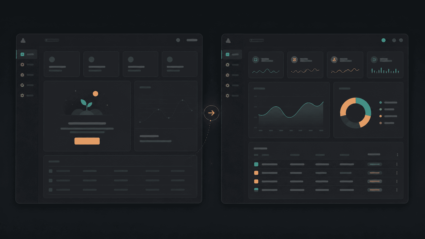
That created a gap in my thinking.
That created a gap in my thinking.
I had designed the dashboard for the moment when the product already had value. I had not always designed the experience that helped the user reach that moment.
That is when I started to understand the importance of empty states.
An empty state is often the first real experience a user has with a product. It is the point where they are trying to understand the system, explore its features, and figure out what they are supposed to do next.
If the screen is completely blank, the user has to guess.
I had designed the dashboard for the moment when the product already had value. I had not always designed the experience that helped the user reach that moment.
That is when I started to understand the importance of empty states.
An empty state is often the first real experience a user has with a product. It is the point where they are trying to understand the system, explore its features, and figure out what they are supposed to do next.
If the screen is completely blank, the user has to guess.
Is the product working? Is something missing? Did I make a mistake? Is there no value here yet? What should I do first?
Is the product working? Is something missing? Did I make a mistake? Is there no value here yet? What should I do first?
The user can leave before they ever understand what the product is capable of.
The polished dashboard might be the outcome we want to show. But the empty state is often the experience that determines whether the user gets there.
The user can leave before they ever understand what the product is capable of.
The polished dashboard might be the outcome we want to show. But the empty state is often the experience that determines whether the user gets there.
Empty states are not just missing content
Empty states are not just missing content
Initially, my empty states often looked like cards with no items in them. They had the headers, but there was nothing inside them.
For most projects, I used to ask AI to generate dummy data so I could see what the completed version might look like. This was useful for testing the filled state, but it also made the empty state easy to ignore.
I have learned something similar from using new tools. When I find sample projects, demo files, or example content, I understand the tool much faster. I can see what it is capable of, how people use it, and what I might be able to create with it.
Initially, my empty states often looked like cards with no items in them. They had the headers, but there was nothing inside them.
For most projects, I used to ask AI to generate dummy data so I could see what the completed version might look like. This was useful for testing the filled state, but it also made the empty state easy to ignore.
I have learned something similar from using new tools. When I find sample projects, demo files, or example content, I understand the tool much faster. I can see what it is capable of, how people use it, and what I might be able to create with it.
Starting from a blank screen gives me very little direction. A good example gives me a mental model.
The same idea applies to a product’s empty state. Example content can help users understand what the product does and imagine what their own data might look like later. It can turn an empty screen into a preview of value.
Starting from a blank screen gives me very little direction. A good example gives me a mental model.
The same idea applies to a product’s empty state. Example content can help users understand what the product does and imagine what their own data might look like later. It can turn an empty screen into a preview of value.
That does not mean every product should fill the interface with fake numbers. Fake data can be misleading, especially in dashboards where users may treat numbers as real. But there are other ways to make the future state understandable.
That does not mean every product should fill the interface with fake numbers. Fake data can be misleading, especially in dashboards where users may treat numbers as real. But there are other ways to make the future state understandable.
For a visualization, we can show the structure of the chart with a legend, axes, labels, and supporting text. We can explain what the visualization will show once data is available. We can tell the user what action will add the first set of data.
The empty state should not only say that nothing exists yet. It should help the user understand what will exist, why it matters, and what they can do next.
For a visualization, we can show the structure of the chart with a legend, axes, labels, and supporting text. We can explain what the visualization will show once data is available. We can tell the user what action will add the first set of data.
The empty state should not only say that nothing exists yet. It should help the user understand what will exist, why it matters, and what they can do next.
Empty states are a form of onboarding
When we hear the word onboarding, we often think about a welcome screen, a product tour, or a series of tooltips. Those patterns can be useful, but users often skip them. A long tour can also explain features before the user has enough context to understand why they matter.
Empty states give us another way to teach.

They explain the feature at the moment the user encounters it. A blank reports section can explain what reports will contain and how to create the first one. A new project can show the first action required to get started. This type of onboarding is connected to the user’s current task. The user is already looking at that part of the product, so the guidance is more relevant than a general tour.
This also matches Nielsen Norman Group’s view of empty states as opportunities to communicate system status, improve learnability, and guide users toward important tasks. A blank area is not neutral. It creates questions, and the design needs to answer them. Link to article
Not every empty state means the same thing
“Empty state” is a broad term. Not every empty screen represents the same situation.
First use and no content need explanation and a clear first action. No results should help users change a query or remove a filter. A completed task list should communicate success, not failure. Loading should not briefly look like “no data,” and an error needs a recovery path.
These states may look similar because they do not contain the usual content, but their meaning is different. The message, visual treatment, and next action should change with the situation.
Showing value before data exists
The biggest design challenge is this: how do we show the value of a feature before the user has supplied any data?
There is no single answer, but I think a useful empty state usually includes three things:
An explanation of what this area is for.
A preview of what the user will see or be able to do later.
A clear next action that helps them reach that future state.

The preview does not need to be a full set of sample records. It could be a simple chart illustration, a small example, a short description, or labels that explain the structure of the experience.
For a data visualization, the axes and legend can still be meaningful before the chart has values. Supporting text can explain what is being measured, why it matters, and what setup is needed to make it useful.
This is where the empty state becomes more than a placeholder. It communicates what the product promises, what the user needs to do, and what they will get in return.
This is where the empty state becomes more than a placeholder. It communicates what the product promises, what the user needs to do, and what they will get in return.
What I would design from the beginning now
What I would design from the beginning now
I would not wait until the filled dashboard is complete before thinking about the empty state.
I would design the states together: first use, no content, partial content, loading, no results, error, restricted access, completion, and the fully populated state.
I would test it with realistic content: long names, missing values, different data ranges, and partial setup.
When I build or prototype the design myself, I can see these gaps earlier. A screen that looks complete with dummy data may feel confusing when the data is removed. A chart balanced with five values may not work with one.
Building has made me more aware of the distance between a design artifact and a real product.
A practical review
A practical review
Before calling a dashboard ready, I would check what a new user sees first, whether the next action is obvious, and whether the design distinguishes loading, no results, and error states. I would also ask whether the visualization explains its future value. These questions change what we consider “done.”
The dashboard is not the beginning
The dashboard is not the beginning
I still believe the filled state is important. It is where we make difficult decisions about hierarchy, density, data, and actions. It is often the most complex state to organize.
But it is not the beginning of the user’s experience.
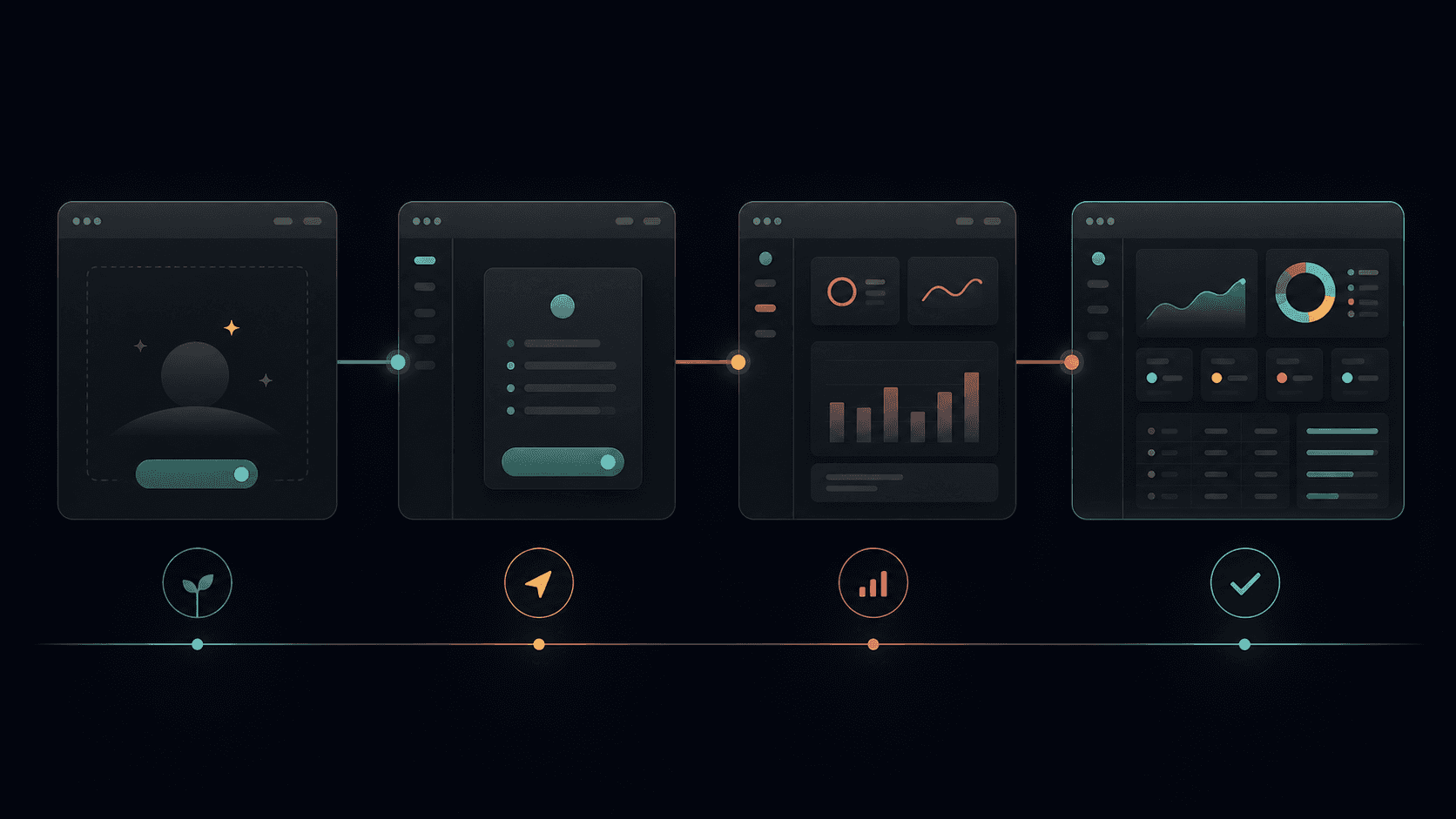
The empty state comes before it. It is where users form their first understanding of the system. It is where they decide whether the product feels clear or confusing, useful or empty, approachable or difficult. The polished dashboard shows what the product can become.The empty state helps the user believe they can get there.
That is why empty states deserve to be designed with the same care as the dashboard itself.
Empty states are a form of onboarding
When we hear the word onboarding, we often think about a welcome screen, a product tour, or a series of tooltips. Those patterns can be useful, but users often skip them. A long tour can also explain features before the user has enough context to understand why they matter.
Empty states give us another way to teach.
They explain the feature at the moment the user encounters it. A blank reports section can explain what reports will contain and how to create the first one. A new project can show the first action required to get started. This type of onboarding is connected to the user’s current task. The user is already looking at that part of the product, so the guidance is more relevant than a general tour.
This also matches Nielsen Norman Group’s view of empty states as opportunities to communicate system status, improve learnability, and guide users toward important tasks. A blank area is not neutral. It creates questions, and the design needs to answer them. Link to article
Not every empty state means the same thing
“Empty state” is a broad term. Not every empty screen represents the same situation.
First use and no content need explanation and a clear first action. No results should help users change a query or remove a filter. A completed task list should communicate success, not failure. Loading should not briefly look like “no data,” and an error needs a recovery path.
These states may look similar because they do not contain the usual content, but their meaning is different. The message, visual treatment, and next action should change with the situation.
Showing value before data exists
The biggest design challenge is this: how do we show the value of a feature before the user has supplied any data?
There is no single answer, but I think a useful empty state usually includes three things:
An explanation of what this area is for.
A preview of what the user will see or be able to do later.
A clear next action that helps them reach that future state.
The preview does not need to be a full set of sample records. It could be a simple chart illustration, a small example, a short description, or labels that explain the structure of the experience.
For a data visualization, the axes and legend can still be meaningful before the chart has values. Supporting text can explain what is being measured, why it matters, and what setup is needed to make it useful.
This is where the empty state becomes more than a placeholder. It communicates what the product promises, what the user needs to do, and what they will get in return.
What I would design from the beginning now
I would not wait until the filled dashboard is complete before thinking about the empty state.
I would design the states together: first use, no content, partial content, loading, no results, error, restricted access, completion, and the fully populated state.
I would test it with realistic content: long names, missing values, different data ranges, and partial setup.
When I build or prototype the design myself, I can see these gaps earlier. A screen that looks complete with dummy data may feel confusing when the data is removed. A chart balanced with five values may not work with one.
Building has made me more aware of the distance between a design artifact and a real product.
A practical review
Before calling a dashboard ready, I would check what a new user sees first, whether the next action is obvious, and whether the design distinguishes loading, no results, and error states. I would also ask whether the visualization explains its future value. These questions change what we consider “done.”
The dashboard is not the beginning
I still believe the filled state is important. It is where we make difficult decisions about hierarchy, density, data, and actions. It is often the most complex state to organize.
But it is not the beginning of the user’s experience.
The empty state comes before it. It is where users form their first understanding of the system. It is where they decide whether the product feels clear or confusing, useful or empty, approachable or difficult. The polished dashboard shows what the product can become.The empty state helps the user believe they can get there.
That is why empty states deserve to be designed with the same care as the dashboard itself.